Branding
THE LAUNDRY HOUSE - BRANDING
THE LAUNDRY HOUSE - BRANDING
THE LAUNDRY HOUSE - BRANDING
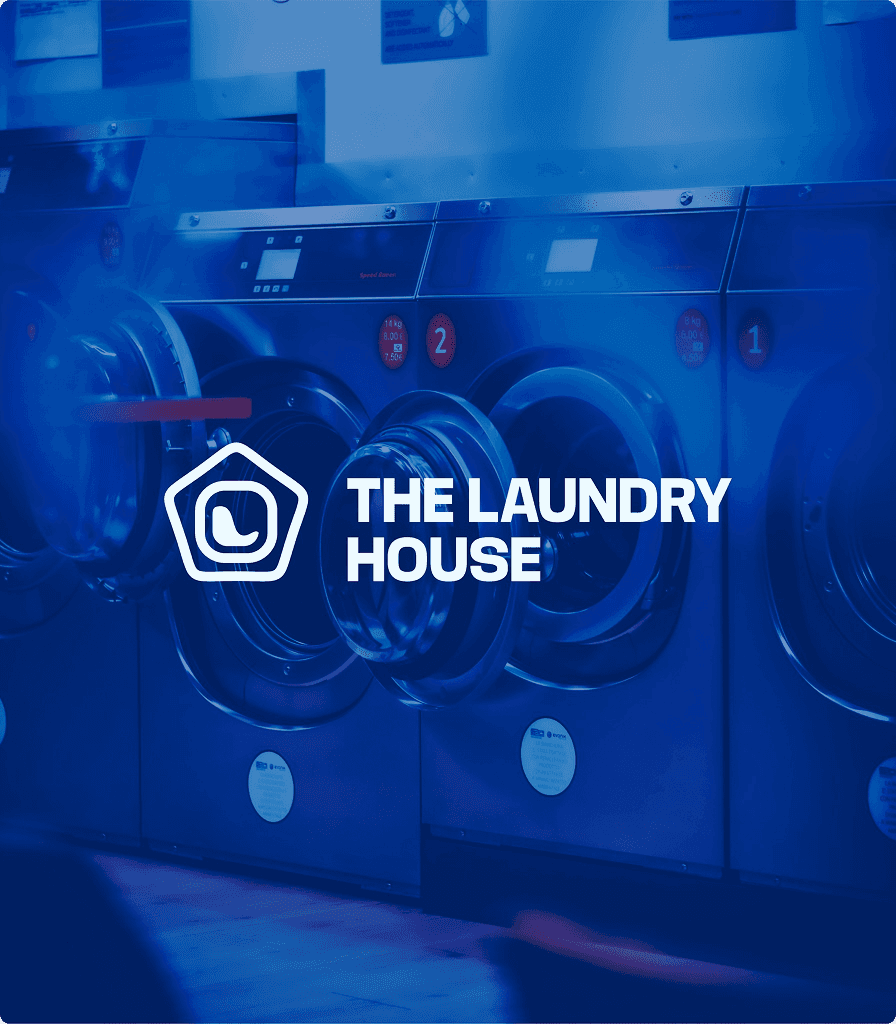
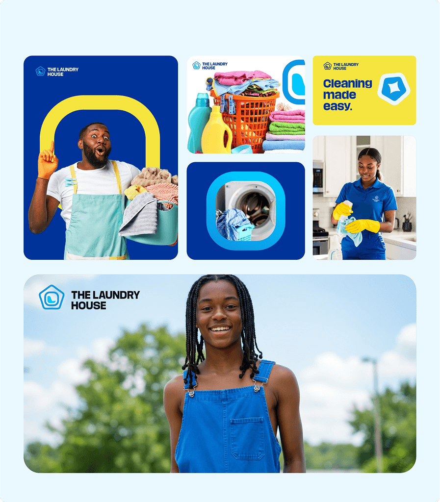
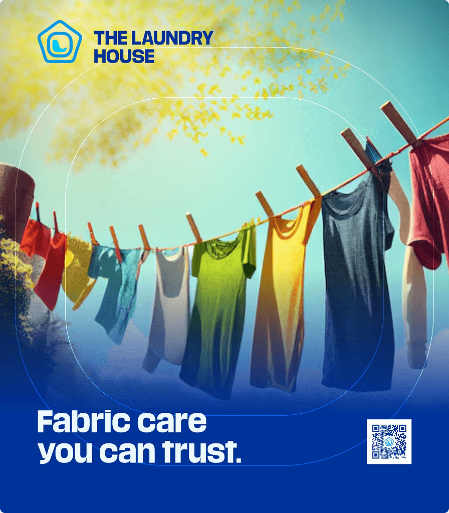
The Laundry House, a brand built to redefine what clean truly means. From premium dry cleaning and crisp ironing to home & office cleaning, The Laundry House is committed to care, convenience, and excellence.
Year :
2025
Industry :
Cleaning
Client :
THE LAUNDRY HOUSE

Brand Overview
Name: The Laundry House
Industry: Laundry & Cleaning Services
Core Values: Care, Convenience, Excellence.
Tagline: “More than clean, we deliver comfort.”
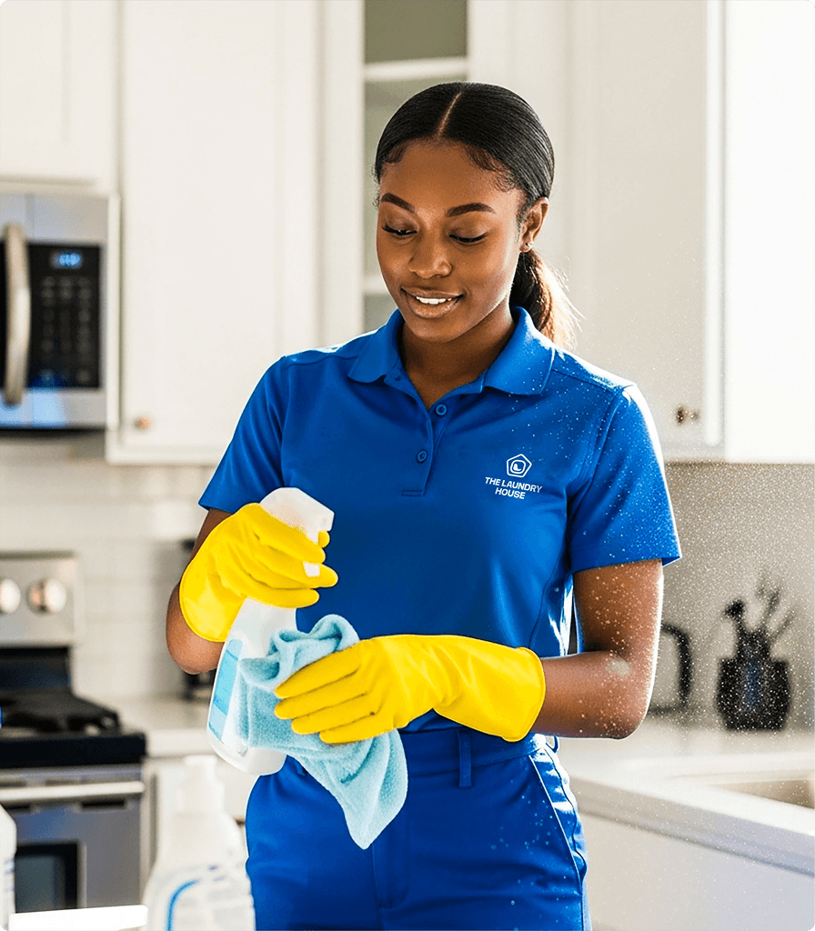
The Laundry House merges professional precision with personal warmth. It’s not just about spotless clothes or tidy spaces; it’s about creating a lifestyle of freshness, calm, and confidence. Every service is performed with the utmost care, ensuring clients feel comforted, refreshed, and valued.
The Core Problem
The Core Problem
The cleaning and laundry industry, though essential, often suffers from inconsistency, lack of trust, and uninspired service experiences.
Many customers associate laundry with hassle, delay, or subpar quality rather than comfort and reliability.
Key Problems Identified
Service Inconsistency: Quality varies between outlets or staff.
Customer Inconvenience: Long turnaround times, poor pickup/drop-off systems.
Lack of Brand Emotion: Laundry services often feel purely transactional.
Poor Visual Identity: Generic, outdated brand looks that fail to inspire trust or recall.
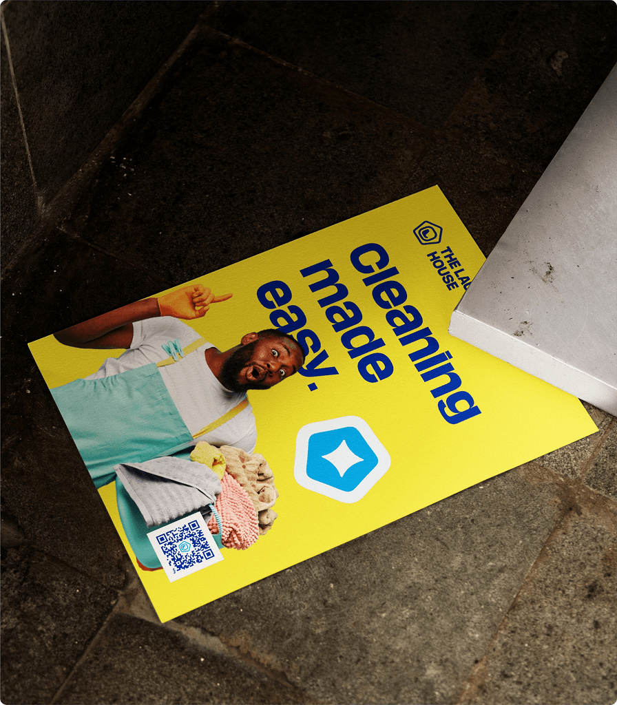
The Brand Solution
The Laundry House introduces a fresh, human-centered approach that blends technology, trust, and thoughtful design to elevate every aspect of laundry and cleaning.
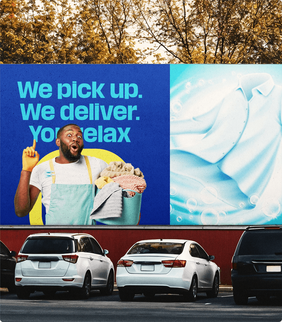
Seamless Service: Easy booking, prompt pickup & delivery for homes and offices.
Consistent Quality: Professional processes, fabric care expertise, and training standards.
Emotional Connection: A warm, trustworthy brand personality built on care and comfort.
Premium Yet Approachable Design: Visual identity that feels elegant, reliable, and modern.
Challenges Faced During Branding
Blending Function with Emotion:
The brand needed to express efficiency and warmth simultaneously professionalism without feeling cold.
Unifying Diverse Services: Laundry, dry cleaning, and home cleaning had to exist under one cohesive visual system.
Creating a Modern Identity in a Traditional Sector: Elevating a typically low-engagement service into an aspirational lifestyle experience.
Designing a Recognizable Icon: Combining symbols of laundry, water, and home into one clear and memorable logo.
Design Process
Phase 1: Discovery & Strategy
Market Research: Explored consumer pain points in convenience, quality, and trust.
Brand Positioning: Positioned The Laundry House as “a modern comfort brand where freshness meets care.”
Brand Personality: Caring, Dependable, Refreshing, Contemporary, and Trustworthy.
Phase 2: Visual Identity Development
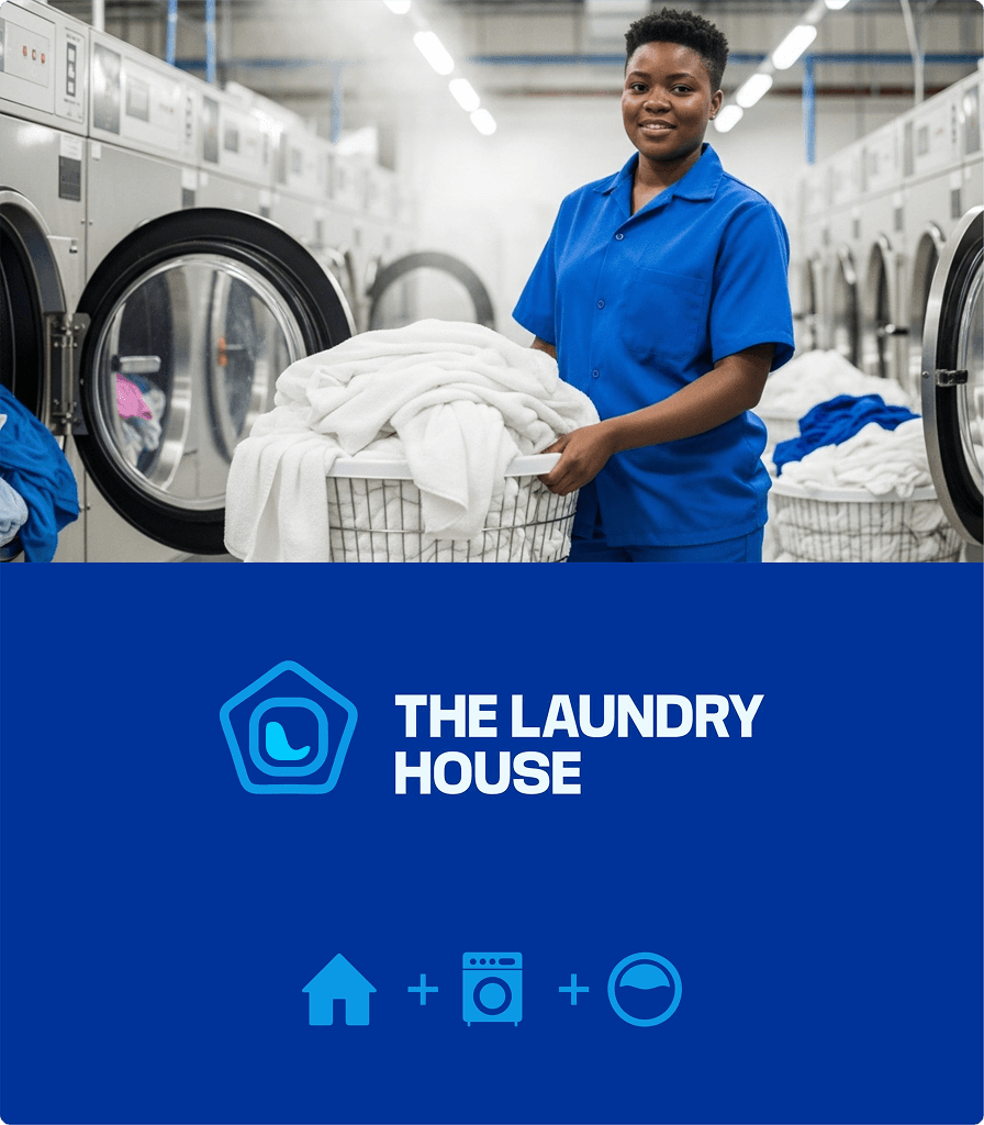
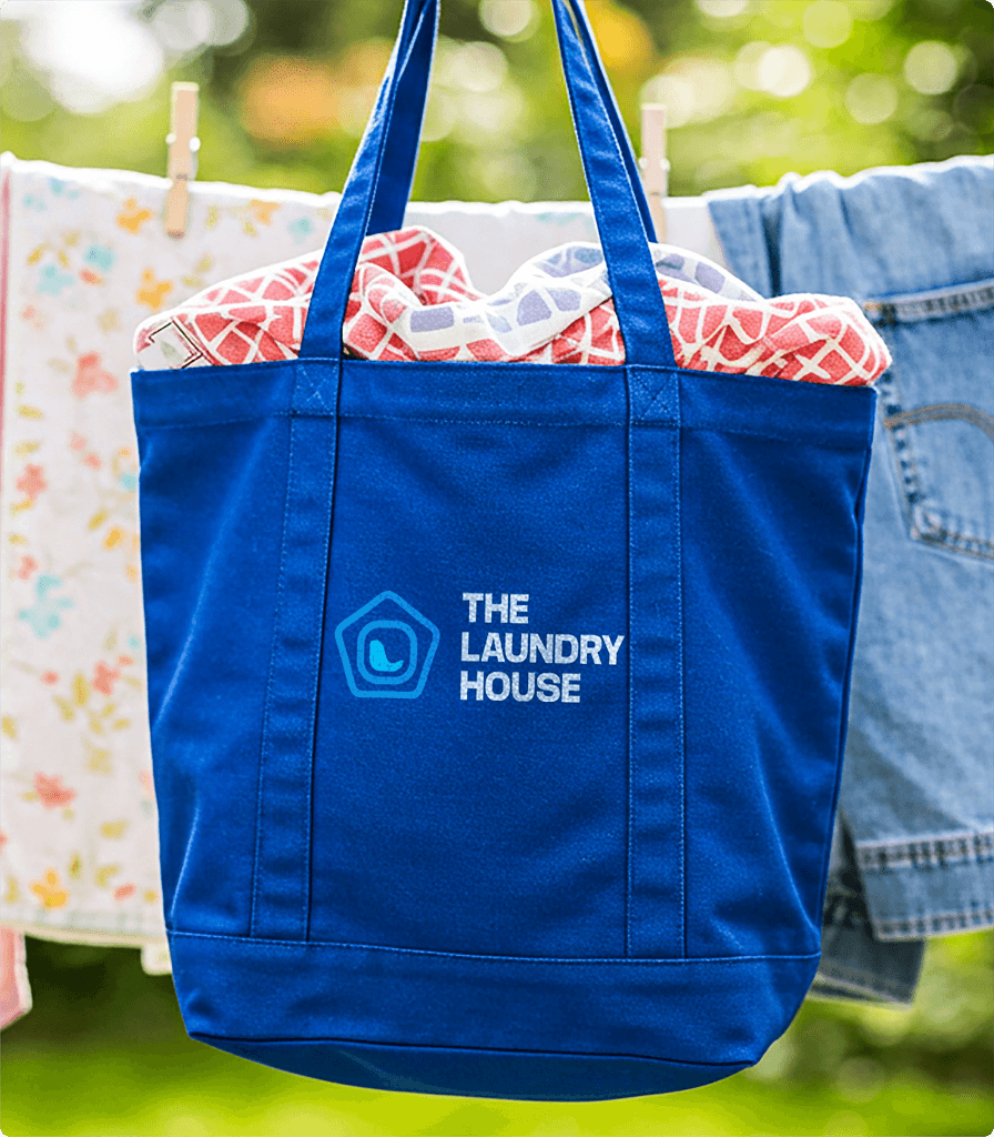
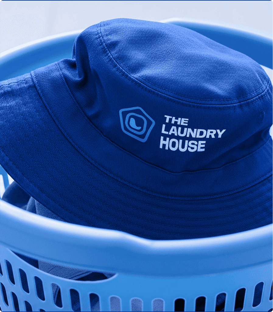
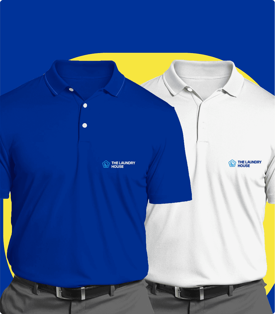
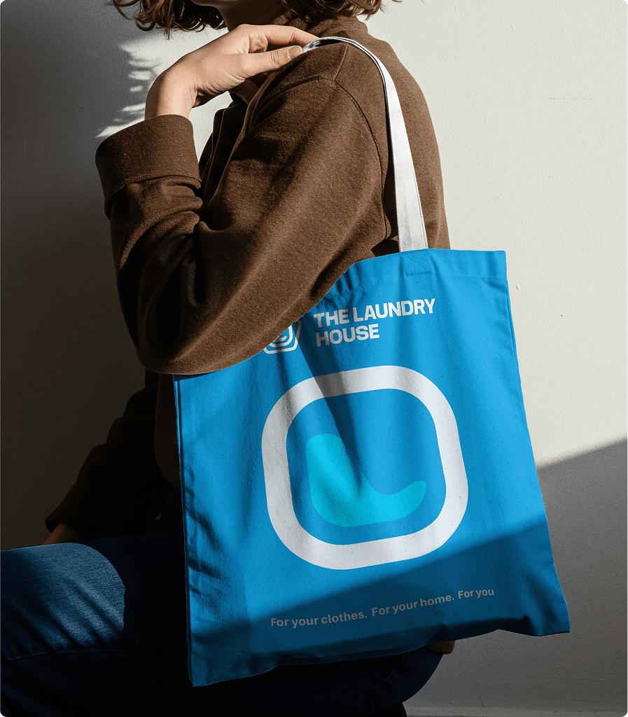
The icon is a harmonious blend of three core elements:
House Silhouette: Represents comfort, safety, and trust.
Washing Machine Symbol: Reflects professional expertise and core service identity.
Flowing Water Element: Symbolizes purity, renewal, and freshness.
Together, they form a cohesive emblem that captures “renewal under one roof.”
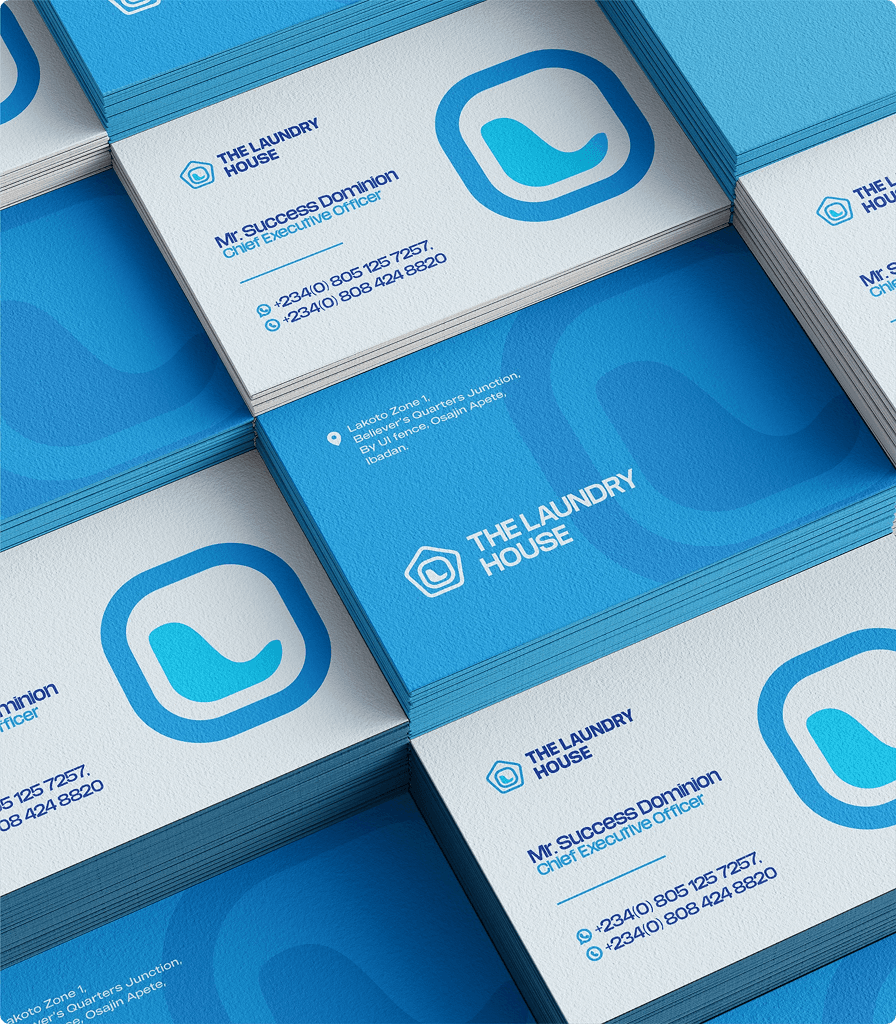
Typography
Primary Font: Poppins / Lato clean, modern, and rounded for approachability.
Secondary Font: Open Sans elegant and readable for marketing materials and digital touchpoints.
Typography was chosen to convey clarity, warmth, and sophistication.
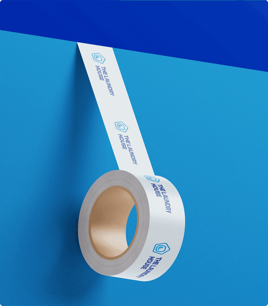
Color Palette
Aqua Blue (#3BC9DB) Freshness, cleanliness, purity
Navy Blue (#1B3B5A) Trust, reliability, and stability
White (#FFFFFF) Simplicity, hygiene, and peace
Soft Grey (#E8EAEA) Modern minimalism and balance
The blend of cool aquatic tones and professional blue creates a refreshing yet credible visual tone.
Iconography
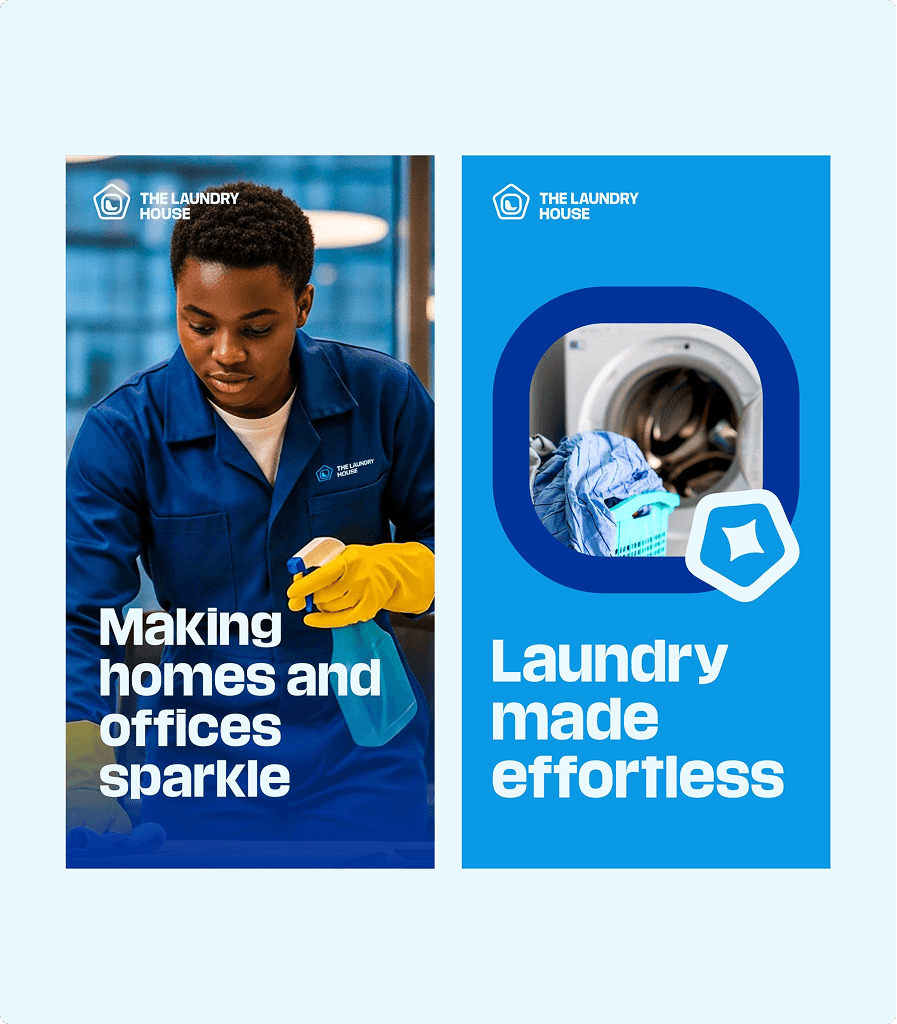
Minimal, rounded icons inspired by cleanliness and comfort (bubbles, hangers, water droplets, homes).
Brand Outcome
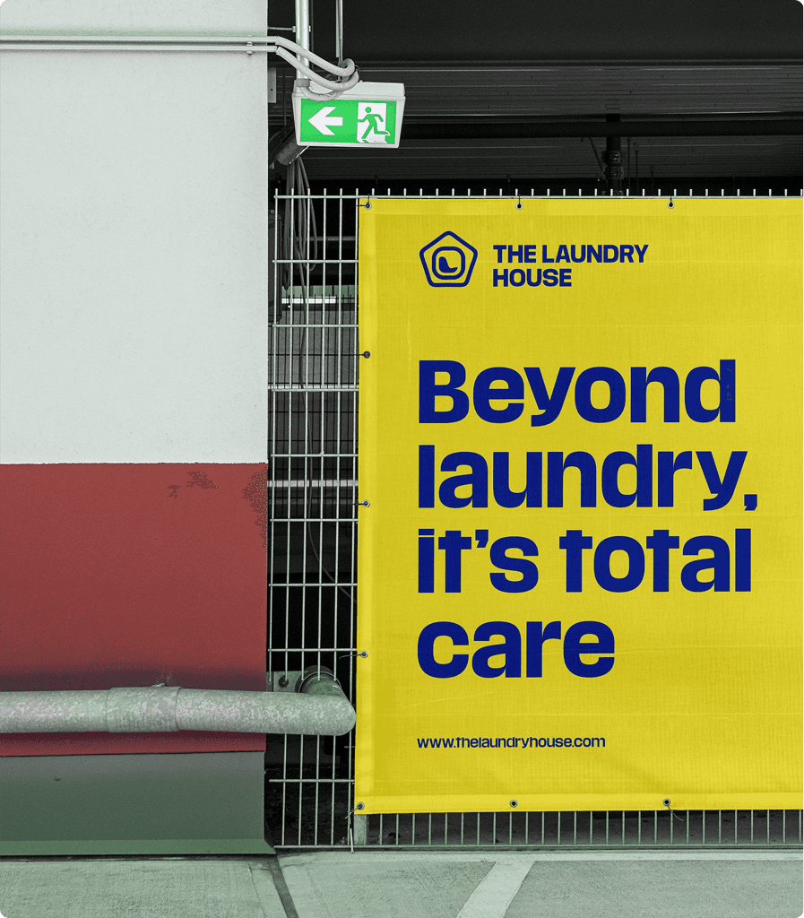
The final identity of The Laundry House successfully unites trust, design elegance, and emotional warmth into a memorable brand experience.
It transcends the functional perception of cleaning and becomes a symbol of renewal and everyday comfort.
More Projects


Branding
THE LAUNDRY HOUSE - BRANDING
THE LAUNDRY HOUSE - BRANDING
THE LAUNDRY HOUSE - BRANDING
The Laundry House, a brand built to redefine what clean truly means. From premium dry cleaning and crisp ironing to home & office cleaning, The Laundry House is committed to care, convenience, and excellence.
Year :
2025
Industry :
Cleaning
Client :
THE LAUNDRY HOUSE
Brand Overview
Name: The Laundry House
Industry: Laundry & Cleaning Services
Core Values: Care, Convenience, Excellence.
Tagline: “More than clean, we deliver comfort.”
The Laundry House merges professional precision with personal warmth. It’s not just about spotless clothes or tidy spaces; it’s about creating a lifestyle of freshness, calm, and confidence. Every service is performed with the utmost care, ensuring clients feel comforted, refreshed, and valued.
The Core Problem
The Core Problem
The cleaning and laundry industry, though essential, often suffers from inconsistency, lack of trust, and uninspired service experiences.
Many customers associate laundry with hassle, delay, or subpar quality rather than comfort and reliability.
Key Problems Identified
Service Inconsistency: Quality varies between outlets or staff.
Customer Inconvenience: Long turnaround times, poor pickup/drop-off systems.
Lack of Brand Emotion: Laundry services often feel purely transactional.
Poor Visual Identity: Generic, outdated brand looks that fail to inspire trust or recall.
The Brand Solution
The Laundry House introduces a fresh, human-centered approach that blends technology, trust, and thoughtful design to elevate every aspect of laundry and cleaning.
Seamless Service: Easy booking, prompt pickup & delivery for homes and offices.
Consistent Quality: Professional processes, fabric care expertise, and training standards.
Emotional Connection: A warm, trustworthy brand personality built on care and comfort.
Premium Yet Approachable Design: Visual identity that feels elegant, reliable, and modern.
Challenges Faced During Branding
Blending Function with Emotion:
The brand needed to express efficiency and warmth simultaneously professionalism without feeling cold.
Unifying Diverse Services: Laundry, dry cleaning, and home cleaning had to exist under one cohesive visual system.
Creating a Modern Identity in a Traditional Sector: Elevating a typically low-engagement service into an aspirational lifestyle experience.
Designing a Recognizable Icon: Combining symbols of laundry, water, and home into one clear and memorable logo.
Design Process
Phase 1: Discovery & Strategy
Market Research: Explored consumer pain points in convenience, quality, and trust.
Brand Positioning: Positioned The Laundry House as “a modern comfort brand where freshness meets care.”
Brand Personality: Caring, Dependable, Refreshing, Contemporary, and Trustworthy.
Phase 2: Visual Identity Development
The icon is a harmonious blend of three core elements:
House Silhouette: Represents comfort, safety, and trust.
Washing Machine Symbol: Reflects professional expertise and core service identity.
Flowing Water Element: Symbolizes purity, renewal, and freshness.
Together, they form a cohesive emblem that captures “renewal under one roof.”
Typography
Primary Font: Poppins / Lato clean, modern, and rounded for approachability.
Secondary Font: Open Sans elegant and readable for marketing materials and digital touchpoints.
Typography was chosen to convey clarity, warmth, and sophistication.
Color Palette
Aqua Blue (#3BC9DB) Freshness, cleanliness, purity
Navy Blue (#1B3B5A) Trust, reliability, and stability
White (#FFFFFF) Simplicity, hygiene, and peace
Soft Grey (#E8EAEA) Modern minimalism and balance
The blend of cool aquatic tones and professional blue creates a refreshing yet credible visual tone.
Iconography
Minimal, rounded icons inspired by cleanliness and comfort (bubbles, hangers, water droplets, homes).
Brand Outcome
The final identity of The Laundry House successfully unites trust, design elegance, and emotional warmth into a memorable brand experience.
It transcends the functional perception of cleaning and becomes a symbol of renewal and everyday comfort.
More Projects
Branding
THE LAUNDRY HOUSE - BRANDING
THE LAUNDRY HOUSE - BRANDING
THE LAUNDRY HOUSE - BRANDING
The Laundry House, a brand built to redefine what clean truly means. From premium dry cleaning and crisp ironing to home & office cleaning, The Laundry House is committed to care, convenience, and excellence.
Year :
2025
Industry :
Cleaning
Client :
THE LAUNDRY HOUSE
Brand Overview
Name: The Laundry House
Industry: Laundry & Cleaning Services
Core Values: Care, Convenience, Excellence.
Tagline: “More than clean, we deliver comfort.”
The Laundry House merges professional precision with personal warmth. It’s not just about spotless clothes or tidy spaces; it’s about creating a lifestyle of freshness, calm, and confidence. Every service is performed with the utmost care, ensuring clients feel comforted, refreshed, and valued.
The Core Problem
The Core Problem
The cleaning and laundry industry, though essential, often suffers from inconsistency, lack of trust, and uninspired service experiences.
Many customers associate laundry with hassle, delay, or subpar quality rather than comfort and reliability.
Key Problems Identified
Service Inconsistency: Quality varies between outlets or staff.
Customer Inconvenience: Long turnaround times, poor pickup/drop-off systems.
Lack of Brand Emotion: Laundry services often feel purely transactional.
Poor Visual Identity: Generic, outdated brand looks that fail to inspire trust or recall.
The Brand Solution
The Laundry House introduces a fresh, human-centered approach that blends technology, trust, and thoughtful design to elevate every aspect of laundry and cleaning.
Seamless Service: Easy booking, prompt pickup & delivery for homes and offices.
Consistent Quality: Professional processes, fabric care expertise, and training standards.
Emotional Connection: A warm, trustworthy brand personality built on care and comfort.
Premium Yet Approachable Design: Visual identity that feels elegant, reliable, and modern.
Challenges Faced During Branding
Blending Function with Emotion:
The brand needed to express efficiency and warmth simultaneously professionalism without feeling cold.
Unifying Diverse Services: Laundry, dry cleaning, and home cleaning had to exist under one cohesive visual system.
Creating a Modern Identity in a Traditional Sector: Elevating a typically low-engagement service into an aspirational lifestyle experience.
Designing a Recognizable Icon: Combining symbols of laundry, water, and home into one clear and memorable logo.
Design Process
Phase 1: Discovery & Strategy
Market Research: Explored consumer pain points in convenience, quality, and trust.
Brand Positioning: Positioned The Laundry House as “a modern comfort brand where freshness meets care.”
Brand Personality: Caring, Dependable, Refreshing, Contemporary, and Trustworthy.
Phase 2: Visual Identity Development
The icon is a harmonious blend of three core elements:
House Silhouette: Represents comfort, safety, and trust.
Washing Machine Symbol: Reflects professional expertise and core service identity.
Flowing Water Element: Symbolizes purity, renewal, and freshness.
Together, they form a cohesive emblem that captures “renewal under one roof.”
Typography
Primary Font: Poppins / Lato clean, modern, and rounded for approachability.
Secondary Font: Open Sans elegant and readable for marketing materials and digital touchpoints.
Typography was chosen to convey clarity, warmth, and sophistication.
Color Palette
Aqua Blue (#3BC9DB) Freshness, cleanliness, purity
Navy Blue (#1B3B5A) Trust, reliability, and stability
White (#FFFFFF) Simplicity, hygiene, and peace
Soft Grey (#E8EAEA) Modern minimalism and balance
The blend of cool aquatic tones and professional blue creates a refreshing yet credible visual tone.
Iconography
Minimal, rounded icons inspired by cleanliness and comfort (bubbles, hangers, water droplets, homes).
Brand Outcome
The final identity of The Laundry House successfully unites trust, design elegance, and emotional warmth into a memorable brand experience.
It transcends the functional perception of cleaning and becomes a symbol of renewal and everyday comfort.